INTRODUCTION
Governments worldwide have gone to great lengths to discourage the consumption of tobacco products1. Despite these efforts, in most countries tobacco companies are still able to use their packages as a way to differentiate their brand and appeal to consumers2. Recognizing the importance of cigarette packaging, many governments have established regulations that limit the packaging elements that can be used by tobacco companies3, and mandated the display of graphic health warnings on packages4,5. In this study, we review the literature on tobacco packaging as a promotional tool and present data from 1689 cigarette packages that were on the market in Canada between 2001–2017. Our objective is to understand how regulatory changes by the Government of Canada relate to variations in packaging design elements over time.
Canada has implemented several tobacco regulations. As a result, the prevalence of cigarette smoking in Canada fell from 25% to 13% in the period 1999–20156. However, smoking remains the number one cause of preventable death in Canada and is a relevant health concern for the nation’s 4.6 million smokers7. In 2011, the Canadian government passed an Act called the Tobacco Products Labeling Regulations-Cigarettes and Little Cigars (TPLR-CLC). The TPLR-CLC requires that all tobacco packages display a graphic health warning covering 75% of the surface of the principal display area of all tobacco packages, up from 50% in 2018. In addition, this regulation mandated the display of a toll-free quitline and a web address to access smoking cessation services. We suggest that, because cigarette manufacturers now have increasingly limited means of promoting their products, one response to such regulations has been to change package design elements in ways that make the product more appealing to consumers.
The tobacco industry has been known to innovate several packaging elements to attract consumers9. These include, but are not limited to, package style, number of cigarettes per package, variant names, iconography, color, and color saturation. Tobacco companies manipulate these packaging elements in an effort to segment markets, create positive associations with their products, and influence consumer perceptions2,10. The extant research suggests that tobacco companies might use package design elements to promote their products to consumers2. Additionally, research shows that government regulations have severely limited the promotional activities that tobacco companies can engage in11. We build on this research to examine whether tobacco manufacturers have made changes to tobacco packaging on a timeline that corresponds with the TPLR-CLC. Given that tobacco companies’ promotional outlets have been restricted, analyzing tobacco packaging before and after the TPLR-CLC was passed should provide insights into how tobacco companies have altered their packaging over time. We note that other regulations might have impacted changes in cigarette packaging over time. We focused on the TPLR-CLC because Health Canada viewed this as being a major and influential regulation.
METHODS
In this research, we assessed a sample of 1689 tobacco packages from 92 brands that were curated by Health Canada. We assessed the changes that have occurred to tobacco packages before (T1) and after (T2) the TPLR-CLC was passed. There were 1202 packages from T1 and 487 from T2. The assessment was carried out by two independent coders, with disagreements resolved via discussion. The coders analyzed the packages based on package style (Kappa=0.897) and package size (Kappa=0.902). The coders also analyzed the focal hue or the color that took up most of the available surface area (Kappa=0.893), the secondary hue or the color that took up the second-most surface area (Kappa=0.911), the degree of saturation of the focal hue, defined as the intensity or purity of the hue (r=0.878), and the degree of saturation of the secondary hue (r=0.913), variant names (Kappa=0.972), and package iconography, including logos and images (Kappa=0.931). A table displaying the coding protocol and detailed statistical analyses for all of our measured variables can be found in the Supplementary file.
RESULTS
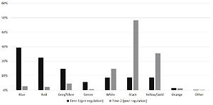
A chi-squared analysis shows significant differences in package style between T1 and T2 (χ2(3)=101.06; p<0.0001). During T1, the majority of packages (62.2%) were slide and shell packages, followed by flip-top (36.4%), soft packaging (1.4%), and slim design (<1%). During T2, most packages were flip-top style (57.1%), followed by slide and shell (40.5%), slim design (2.5%) and soft packaging (<1%). Across T1 and T2, the incidence of flip-top increased significantly, (χ2(1)=61.00; p<0.0001) while the incidence of the slide and shell decreased significantly (χ2(1)=66.69; p<0.0001). The average number of cigarettes per package decreased from 25.16 in T1 to 22.21 in T2 (t(18)=3.03; p=0.002). Significant changes in the focal hue were observed across T1 and T2 (χ2(10)=672; p<0.0001), as shown in Figure 1. According to pairwise chi-squared tests, the use of blue, red and grey/silver decreased from T1 to T2 (χ2s>35; ps<0.001), while the use of white, black and yellow increased (χ2s>13; ps<0.001). The use of secondary colors also changed pre- and post-regulation (χ2(11)=569.63; p<0.0001). Pairwise chi-square tests indicate that the use of blue, red and yellow as secondary hues increased (χ2s>36; ps<0.001) while the use of white and black as secondary hues decreased (χ2s>104; ps<0.001) from T1 to T2.
We also observed a substantial increase in the use of high focal hue saturation during T2 (χ2(2)=429.17; p<0.0001). Pre-regulation, high color saturation was only found in 35.8% of packaging. Post-regulation, 91.4% of packaging contained high color saturation. For secondary color saturation, there was a significant increase in the use of high, rather than medium, color saturation after the packaging regulations were implemented (χ2(1)=428.49; p<0.0001). Pre-regulation, 16.5% of the background colors contained low color saturation, 47.8% contained medium color saturation, and 35.8% contained high color saturation. In contrast, post-regulation background colors contained on average 2.1% low saturation, 6.6% medium saturation, and 91.4% high saturation.
The use of variants changed from T1 to T2 (χ2(6)=126.68; p<0.0001). There was a decrease in flavor variant labels from 43.1% to 30.3% (χ2(1)=23.53; p<0.0001), as well as the disappearance of light or mild labels, from 9% to 0% (χ2(1)=46.07; p<0.0001). Additionally, the use of color variants increased substantially from 12.8% to 29.4% (χ2(1)=65.16; p<0.0001). The use of no variant also increased over time from 13% to 18.8% (χ2(1)=9.18; p=0.0024).
The use of iconography changed significantly between T1 and T2 (χ2(1)=218.3; p<0.0001). Male figures in brand logos almost disappeared, from 35.1% pre-regulation to 1.4% post-regulation (χ2(1)=205.69; p<0.0001), while the use of women in brand logos increased from 7.8% to 11.2% (χ2(1)=4.85; p=0.0276). The use of crests increased substantially, from 29% to 44.1% (χ2(1)=35.18; p<0.0001). In addition, the number of brands with no logo or iconography increased from 18.6% to 32.5% (χ2(1)=37.88; p<0.0001).
DISCUSSION
The results of this research provide evidence of systematic changes to tobacco packaging corresponding to the passage of the TPLR-CLC in Canada. It is likely that tobacco companies have made changes to their packages to attract customers, at least in part, as a response to the constraints placed upon them by the TPLR-CLC. For example, an increase in the use of flip-top packaging can be seen as more modern, elegant, or unique, which serves to increase purchasing preference in younger people, especially younger women, who have been shown to prefer smaller packaging styles9,10. This preference may also explain why we observe that the average number of cigarettes per package has decreased over time. The increased usage of black and yellow as focal colors as well as increased color saturation is likely an effort to attract attention, as research shows that black and yellow are effectively used on tobacco packaging for this purpose12,13. Moreover, these attributes may serve to draw attention away from the unsightly health labels and to differentiate the brand. The increased usage of brand variant labels and female figures on packaging may be an effect of strategies pursued by tobacco companies to influence positive consumer perceptions of their products in light of increasingly restrictive packaging regulations. The decreased usage of males in iconography suggests that manufacturers may be targeting women. However, it is important to note that these findings are correlational in nature. It is possible that tobacco companies naturally innovate their package design to better market their products, and we cannot be absolutely certain that all of these observed changes were caused by the implementation of the TPLR-CLC.
CONCLUSIONS
The results of the present study provide evidence of systematic changes to tobacco packaging corresponding to the passage of the TPLR-CLC in Canada. The observed changes include: an increase in the use of flip-top style packaging; white, black and yellow as focal colors; blue, red and yellow as secondary colors; overall color saturation and color-themed variant labels; a decrease in the number of cigarettes per package; and use of iconography containing male figures. We hope that these findings supplement other research demonstrating that tobacco manufactures alter elements of package design as a function of regulatory changes.